Rebuilding the ConvertKit Dashboard
A few weeks ago I sent a heated email to the ConvertKit founder, Nathan Barry. I demanded he rebuild the platform’s dashboard to provide more insights. Just for me.
But he never responded.
And that’s what I expected. Not because he’s a busy guy running a popular email marketing platform. It’s because I never sent him an email.
I’m not that crazy.
But I do wish the ConvertKit dashboard would display more metrics. It shows email open rates, click-through-rates, and recipients per email within your selected time range.
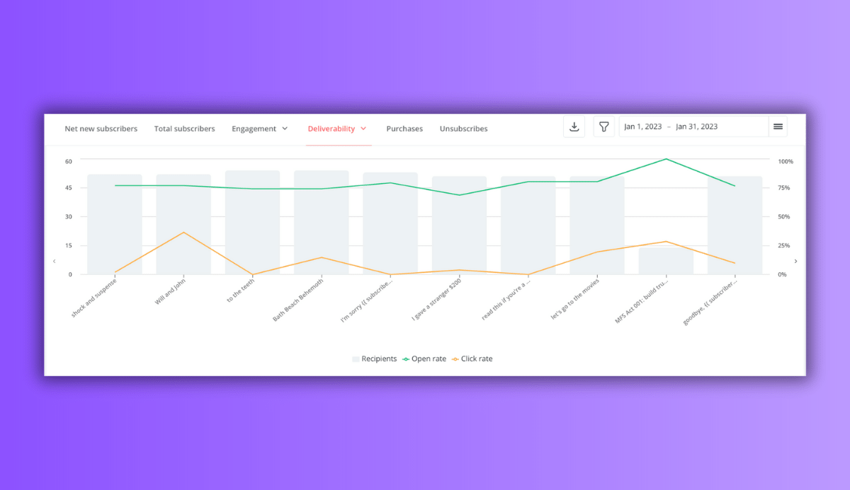
Although there’s one thing missing -- the averages over your selected range.
This is why we’re here.
Using my good ole pal Excel, I smuggled my email data out of ConvertKit to build the dashboard myself.
Here’s the breakdown of this project:
- Finding the problem
- Smuggling the data
- Executing an escape plan
- Cleaning data
- Exploring
- Creating the dashboard
- Examining Flaws
Finding the Problem
My goal with this project is simple:
Recreate the ConvertKit dashboard but display average KPIs based on the selected time range.
Sounds simple, right?
Well, there’s one important detail not mentioned yet. The dashboard has to be interactive. You need to be able to click on different months to display different data.
But first let’s begin with everyone’s favorite part of analysis projects…
The Data.
Smuggling the Data
ConvertKit is nice enough to make smuggling data easy for users. I didn’t have to write a python script to scrap the data (although that would have been fun). The platform creates CSV files for exporting to Excel.
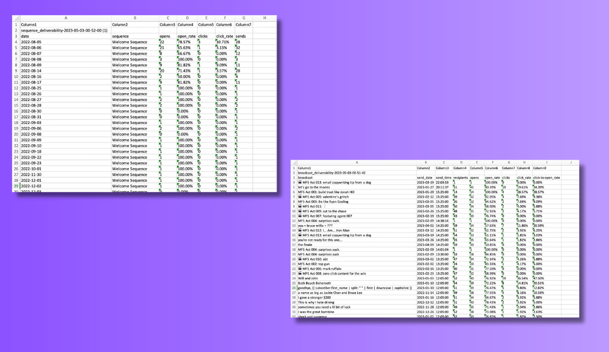
For this project, I focused on two types of data:
- Email Broadcasts
- Email Sequences
Broadcasts are one-off emails written and sent once. Sequences are automated emails sent once a trigger occurs (such as a welcome email sent when someone subscribes to your list).
Cleaning
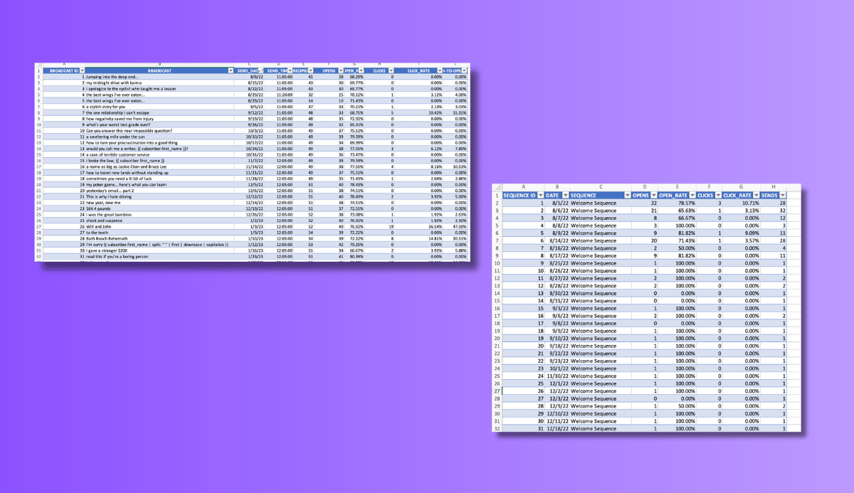
ConvertKit makes the data look nice once it’s downloaded, but we have to be careful. I mean, let’s make an analogy here…
Pretend you walk into your friend’s kitchen and the floor looks spotless. Are you gonna eat food off of it? Probably not (unless you’re a psycho).
You’d do what any sane human being would do, clean it yourself… Then eat off the floor.
The same works for data. Even though the numbers and text values look nice, it doesn’t mean they’re good to eat off of.
So I cleaned the data before moving on to the next step…
Exploring
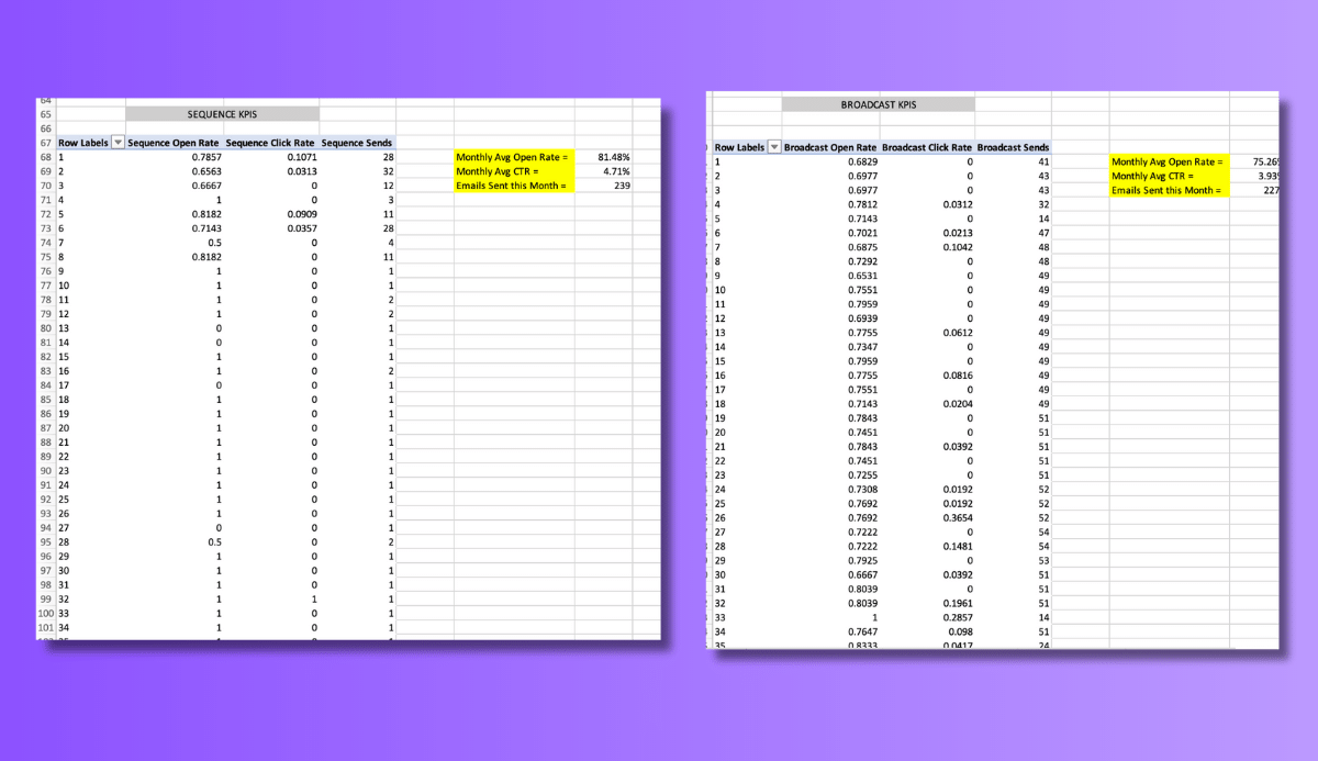
Once ready, I created two pivot tables -- one for broadcast data and one for sequence data.
The only metrics necessary for the dashboard are email:
- Open rates
- Click-through-rates (CTR)
- Sends
Simple AVG() and SUM() functions made it easy to perform the calculations needed for the dashboard.
Rough Seas
I turned the Pivot tables into line graphs over bar graphs but was far from finished.
This is where the seas became rough.
I hit a major roadblock.
The visuals were messy and showed all 52-80 lines of data. But remember, we want the dashboard to be interactive. That meant allowing users to select different time ranges based on email send date.
At first I couldn’t figure out how to do this…
Until I remembered Excel's timeline function. The interactive tool allows you to select individual (or multiple) months at a time.
This meant I was ready. The only thing left to do was recreate the dashboard.
And this happened…
The Final Dashboard

The Flaws
Even though the dashboard includes the data I wanted and is interactive as planned, it’s not perfect. There are two major issues that I never solved:
- Switching between sheets
- Data labels
One: switching between sheets
I originally planned to create two identical dashboards on two separate sheets in Excel. And you’d navigate them using buttons on the left side of the sheets (as seen below).
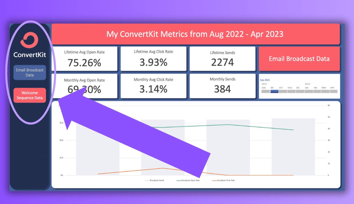
But to do this required using Excel Macros.
And while I’m familiar with them, I usually use them on Windows not Mac. But for this project I was forced to use my MacBook.
When it comes to Excel (and Microsoft Office in general), Windows is like Batman while Mac OS is like Robin...
They’re both heroes, but we all know who’s better.
No matter how much troubleshooting I did, my MacBook didn’t want me running Excel Macros. So I settled. Instead of the fully interactive design, you have to switch between dashboards by clicking the sheet pages at the bottom of Excel (BORING).
Two: data labels
When you hover over a bar or line graph in ConvertKit’s dashboard, you’ll see the data label shown in the image below…

I wanted to recreate that with my dashboard. I wanted to highlight all of the metrics you see on ConvertKit:
- Recipients
- Open Rate
- Click-through rate
- Click-to-open rate
But either Excel isn’t capable of creating data labels this intuitive or my advanced Excel skills need some work.
Even though I couldn’t concoct data labels on par with ConvertKit’s designers, the dashboard still looks and functions the way it should.
So that makes me happy.
Final Words
Overall creating the dashboard was fun. And it allowed me to flex some of my visualization skills. But those two flaws still haunt me. As I learn more about my buddy Excel, I'm hoping to come back to the dashboard in the future and improve my designs.
But until then, I'm stuck with this.